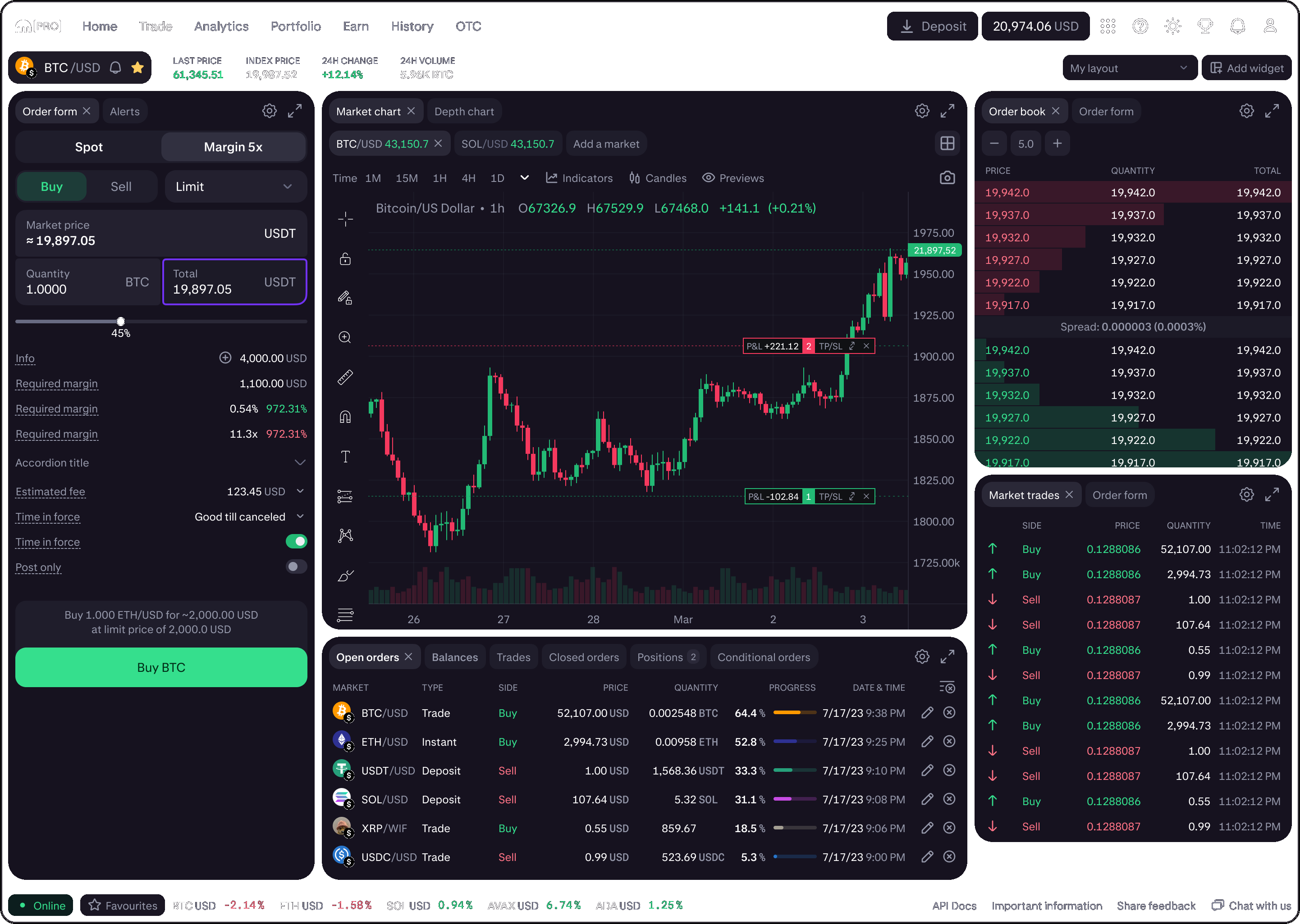
Building 1KDS
I led the creation of a single design system adopted across Pro and Consumer, fully coded, light and dark, and used by ~60 designers and ~200 engineers.
Kraken is a major crypto exchange. I joined in April 2022 as a sr staff designer and left December 2024. For most of that time I was the senior member of a three-person design system team, turning a Pro foundation file into 1KDS, one system for the whole product line.
One system
When I arrived, design systems were politicized: separate directions for different product surfaces. I pushed for a single system with semantic color instead of raw gray ramps, accessibility built for IPO readiness, light and dark from day one, and components that scaled from atoms to full product screens.
By the time I left, 1KDS was fully coded, company-wide, and had absorbed a rebrand without forking the system.
Foundation
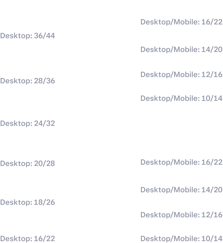
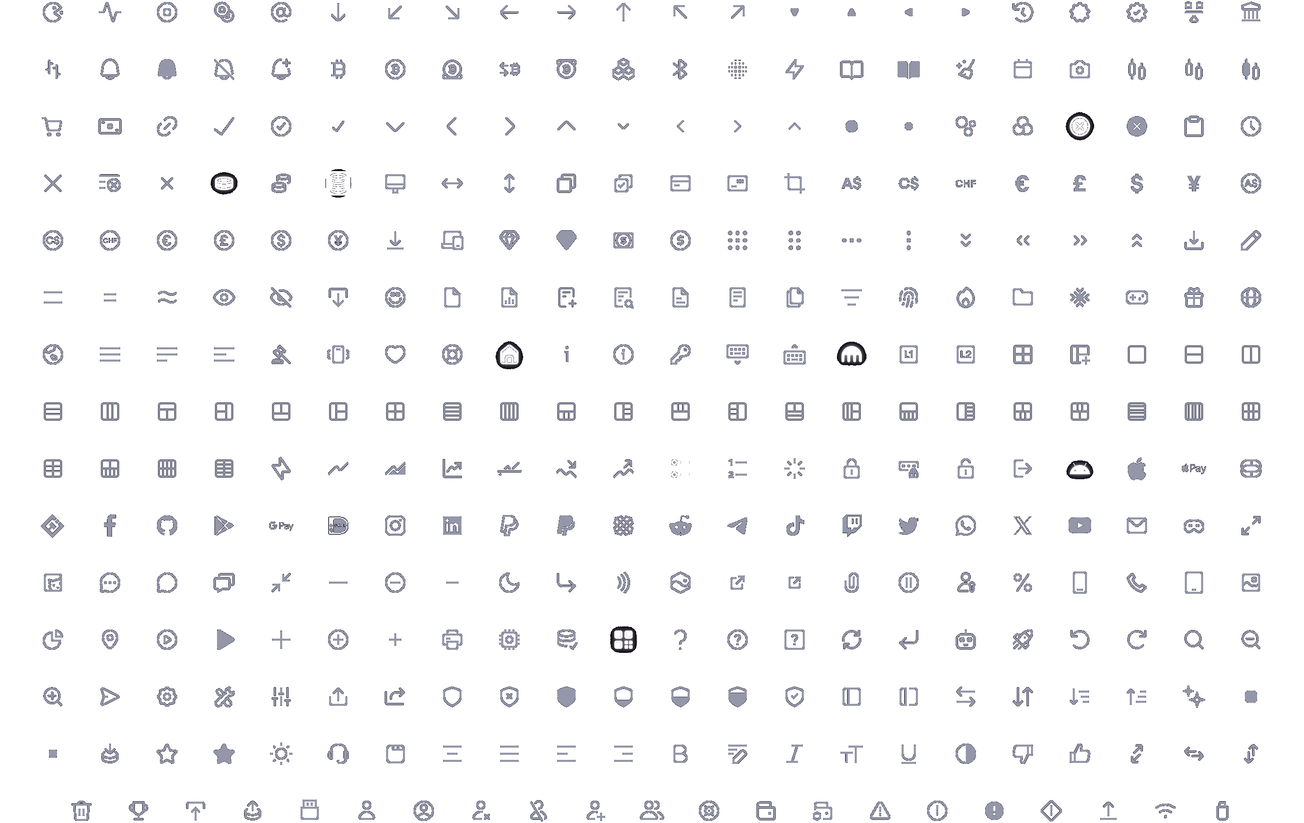
A design system only scales if the foundation is deliberate. Before components, we locked colors and semantic color variables, typography, spacing, and icons — the hard requirements every product team would share. Get those wrong and every atom above them inherits the mistake.
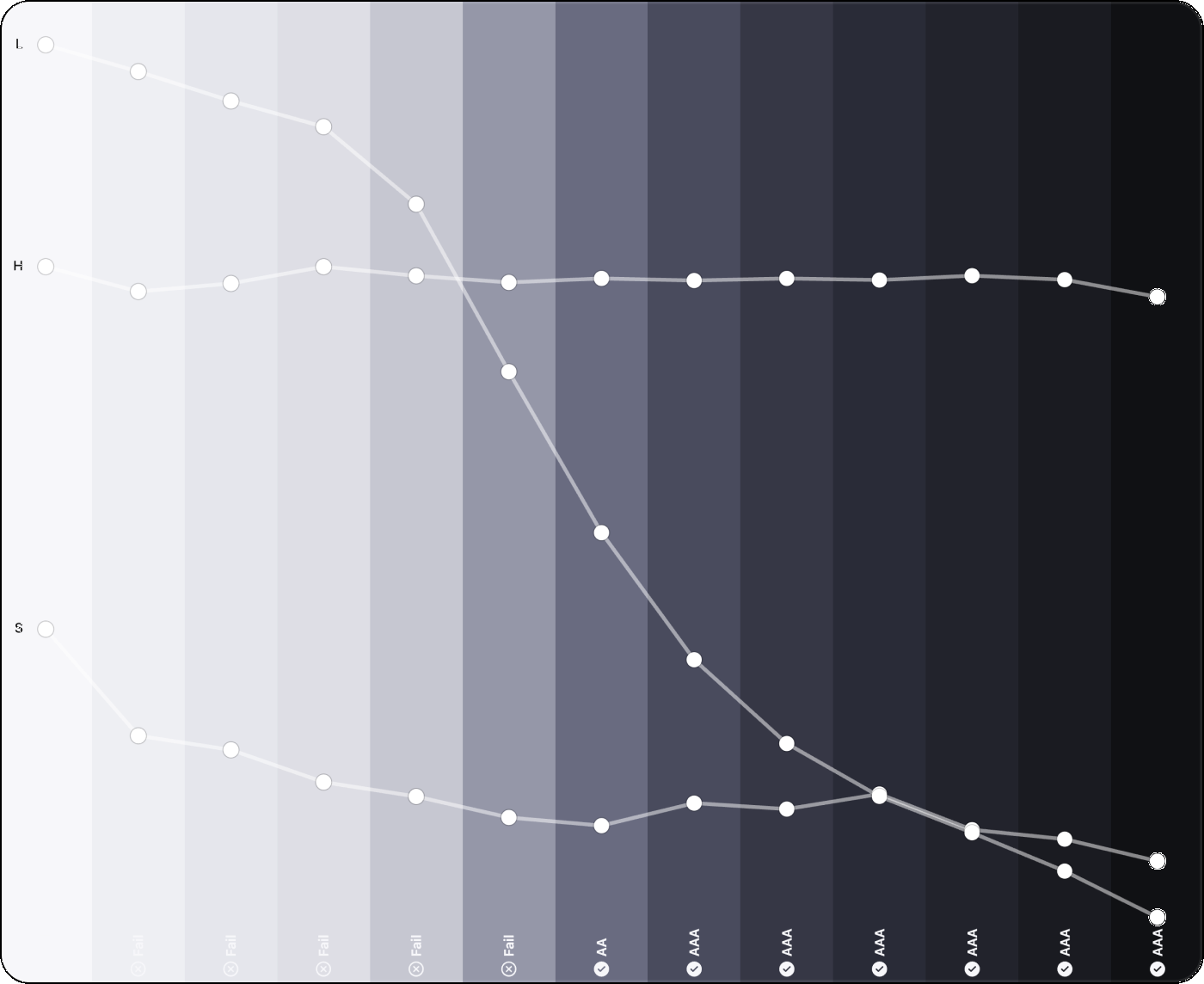

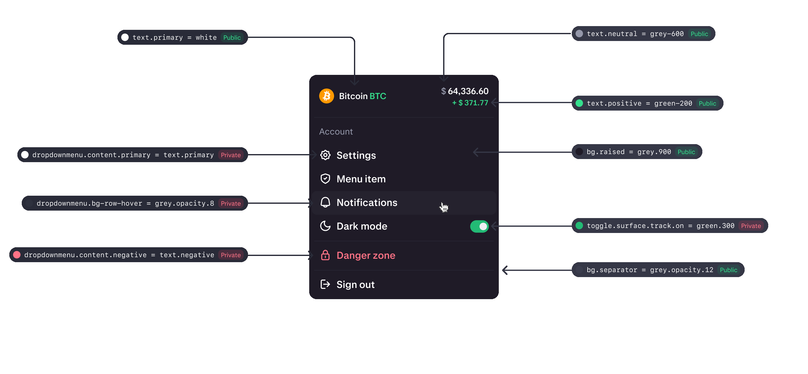
Variable management
Core color and type tokens were public so every product team shared the same foundation. Component-level variables stayed private to the system, so product files consumed components without forking the token model. Modes covered dark, light, and magic — when Kraken rebranded, new brand colors landed in that structure instead of spawning a second system.
Pro and Consumer modes
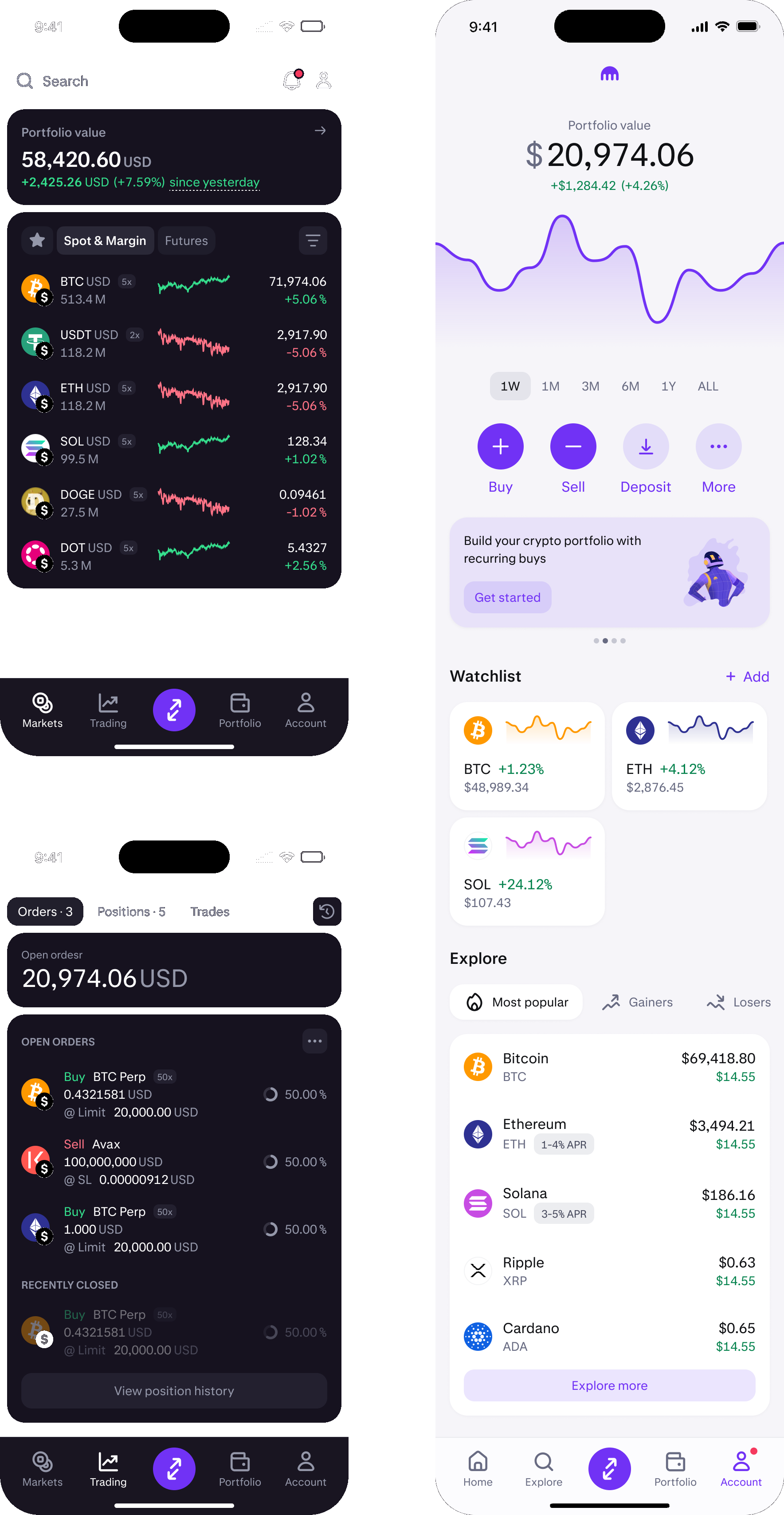
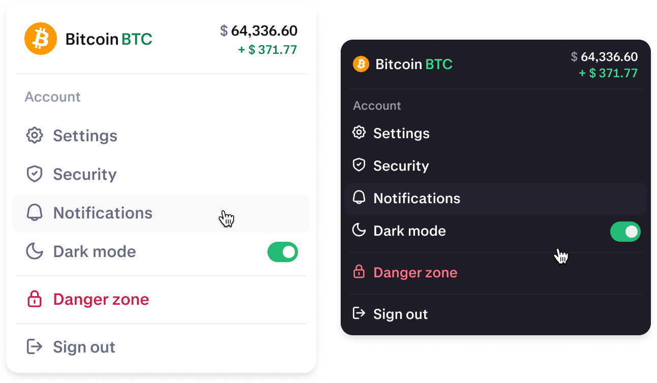
We created light and dark modes — but Kraken doesn’t really have light and dark. It has Consumer and Pro. Consumer is light and more spacious; Pro is dark, denser, and everything is smaller. The system was built to serve both. Instead of a single body style we shipped body 16, body 14, and body 12 so each platform could use the right size — Consumer at 16, Pro tighter and more compact. Below, the same components switch from light to dark and read as two different products.
Components with engineering in mind
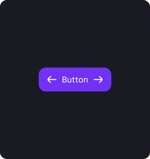
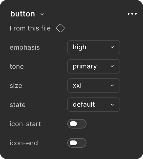
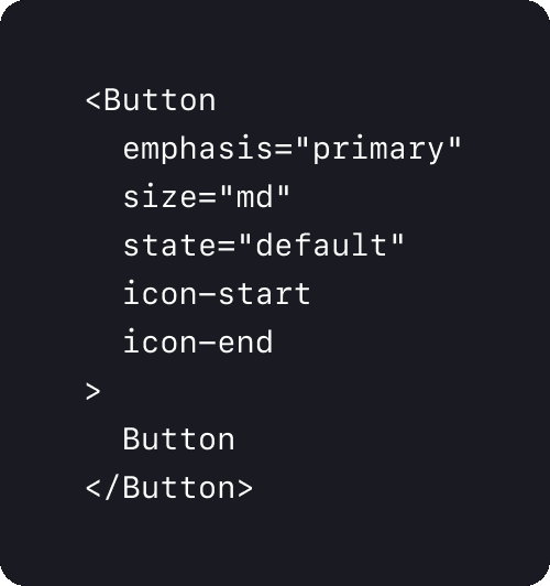
We aligned Figma component properties with the coded API. The same attributes designers flipped in the right panel — emphasis, size, state, icons — were the same property names engineers used in code. That one-to-one mapping made handoff tighter and implementation more robust.
Atomic approach
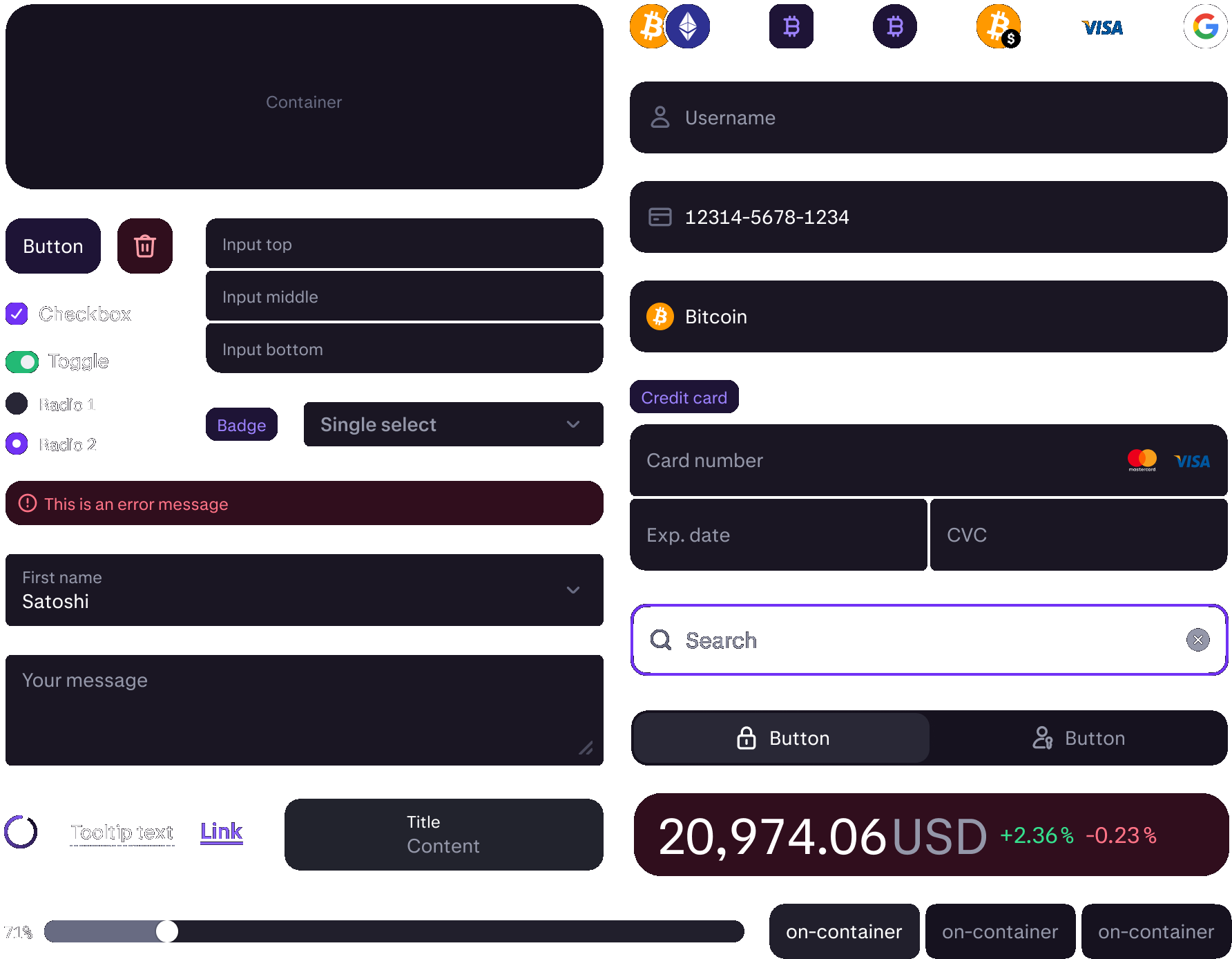
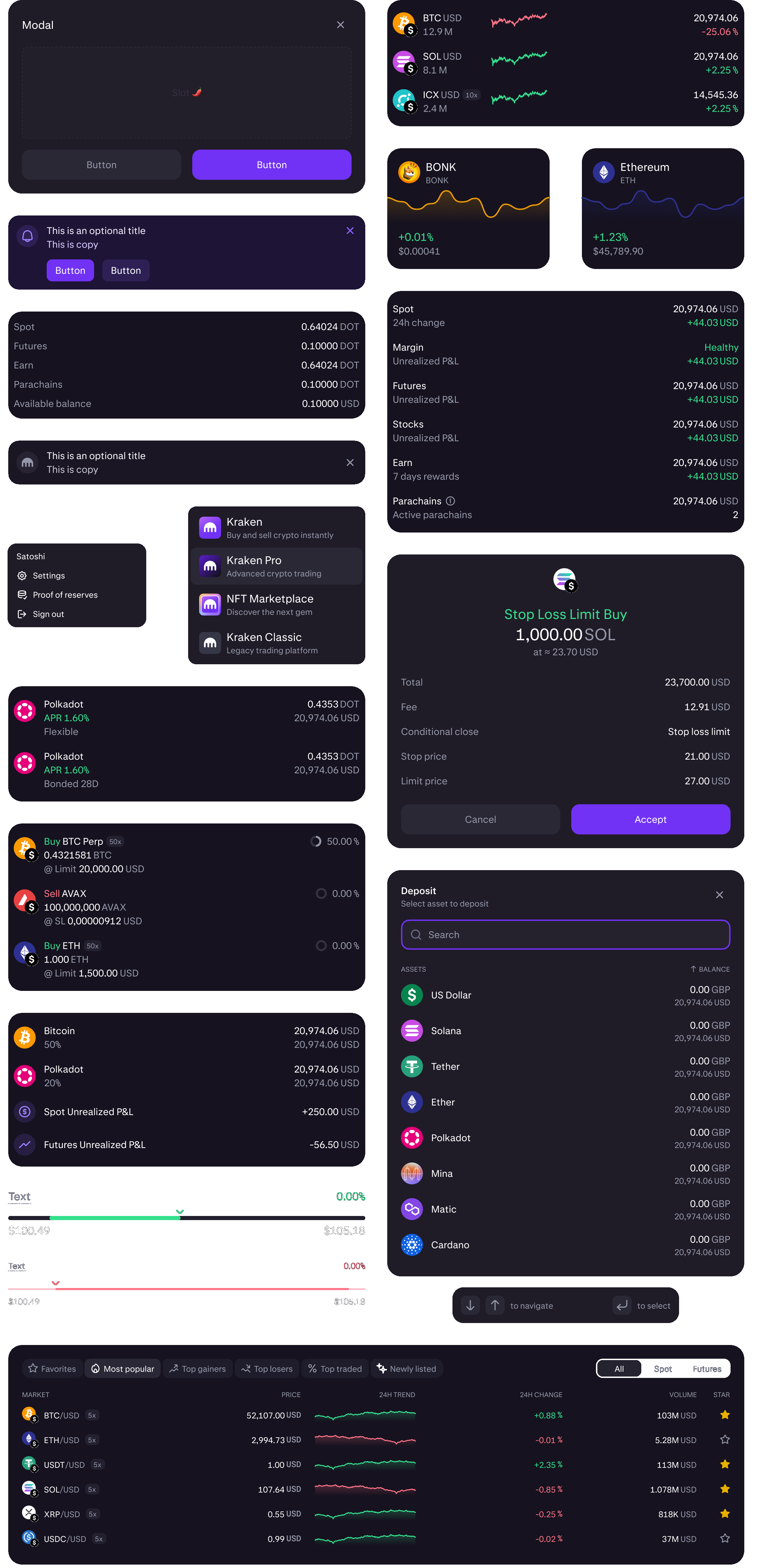
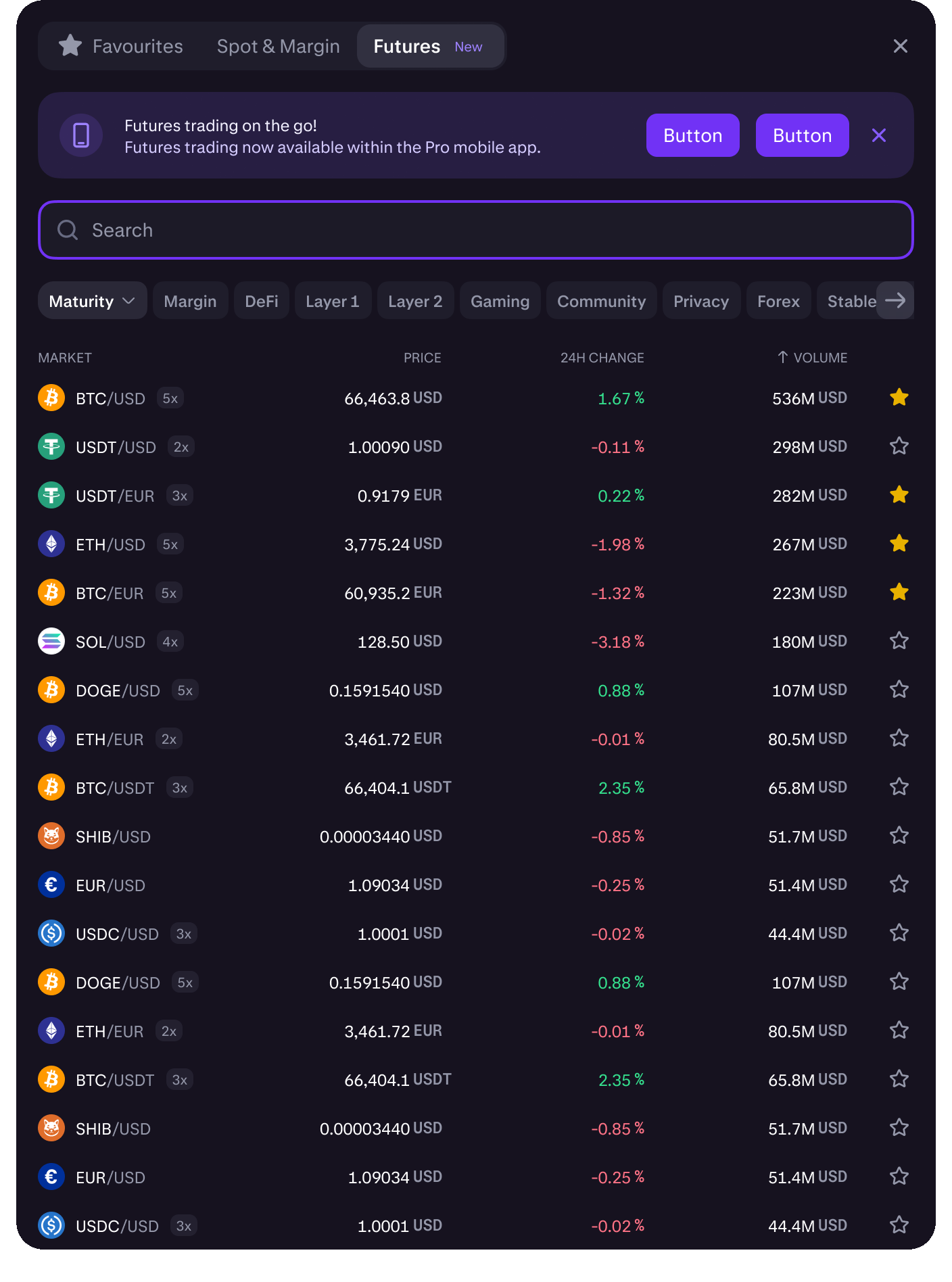
Atoms weren’t the end product. Buttons, toggles, and badges had to compose into molecules, then organisms — market selectors, mobile home, and the Pro trade terminal — so the system shipped as real product UI, not just a component library.