Founding Design
In 2011 I joined as founding designer for my first San Francisco startup adventure
This was my first “real” job as a designer. In my previous work I was a software engineer transitioning to design on my own. I was very nervous and excited. This was also the begining of my 10 year stay in the USA.
Telly (previously Twidvid) was a fast moving company that was trying to disrupt a very competitive market, video discovery. At the time Youtube was lacking discoverability, Netflix and Instagram Reels did not exist. The future would define Vine as the clear winner, which was then acquired and closed by Twitter in 2016.

Web and Mobile
The company was building 4 different platforms: an iphone, ipad, and android apps, and a web platform. There was no marketing website or branding either.
The process was very straight forward. There was clear tasks to tackle since there was a lot of work. I was sitting right by the side of the founders so we could brainstorm ideas, layouts and new features at any time. We had daily scrum meetings.
I did a lot that year. Web and Mobile product design, branding, marketing design, video creation and edition, photography, code... I entirely coded the navigation of the web UI and was be very involved with the mobile developers in order to provide the right assets for their needs.
Rather than showing you pixelated Photoshop images, I decided to redesign the screen from 2012 on Figma for practice.
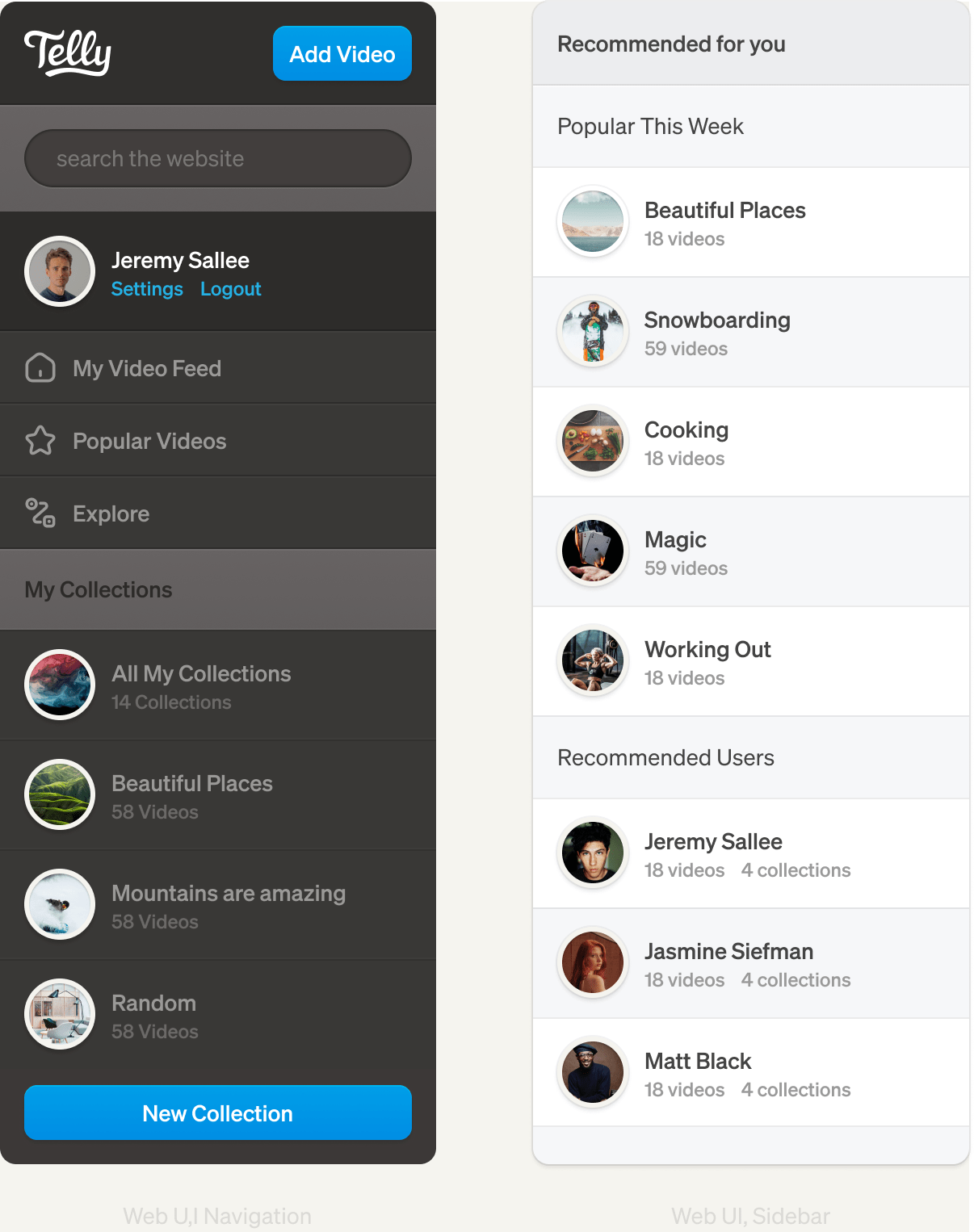
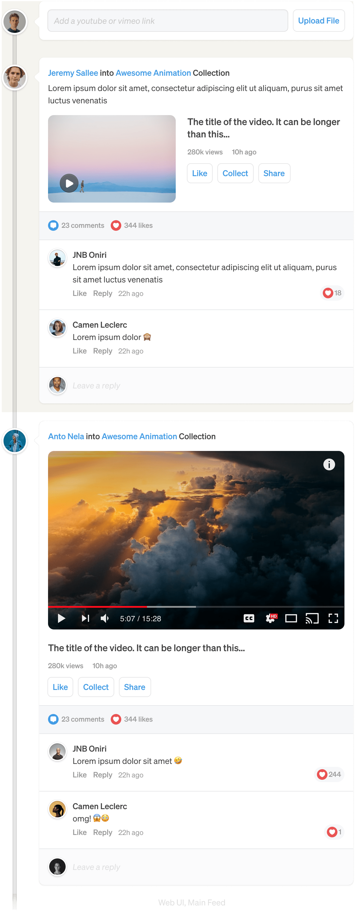
These where the times of high Skeumorphism. Everything was embossed, beveled and shadowed. Here is the design of the video feed. At the time the goal was to make a video feed where people could discover and save videos.
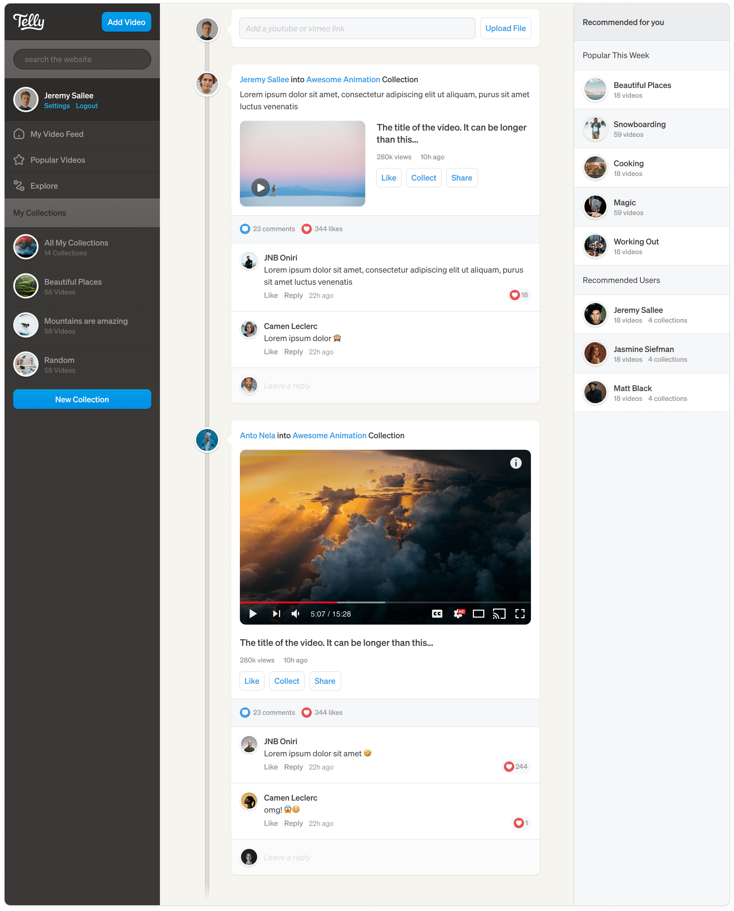
The web UI was by far the most complex of all the platforms. Here are all the elements coming together:
iPhone Native Application
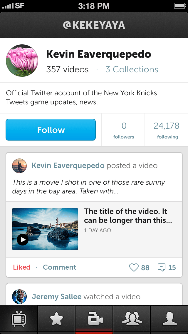
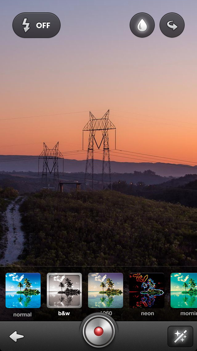
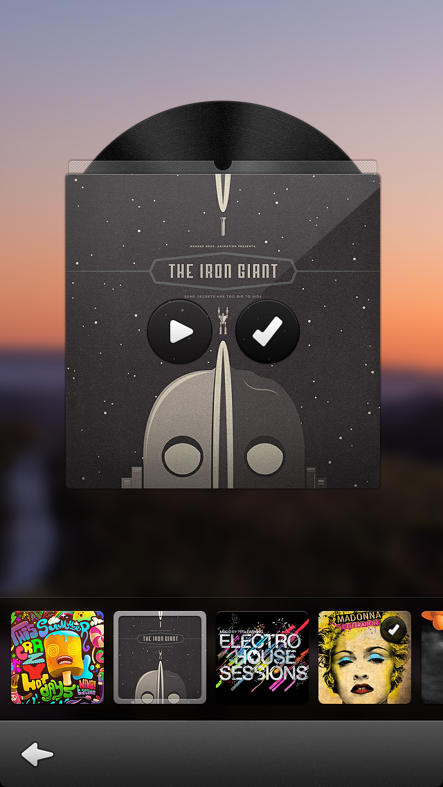
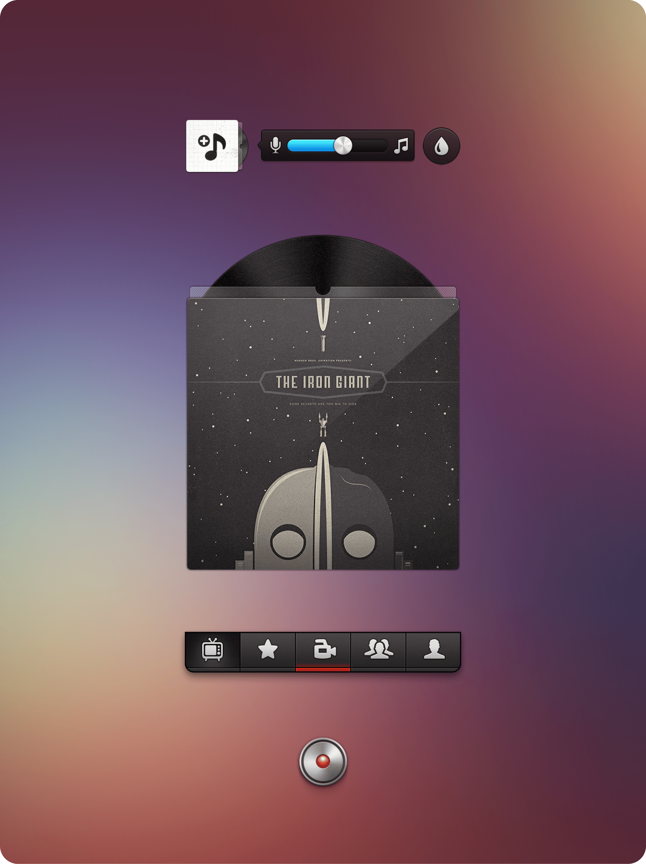
The iPhone native design was the most fun to make during that experience. At the time skeumorphism was king and Telly mobile designs are a statement of that. Especially the video recording flow. I made filter covers, CD covers and a very realistic record button that would turn and glow while recording.
Here are a few design pieces from back then:
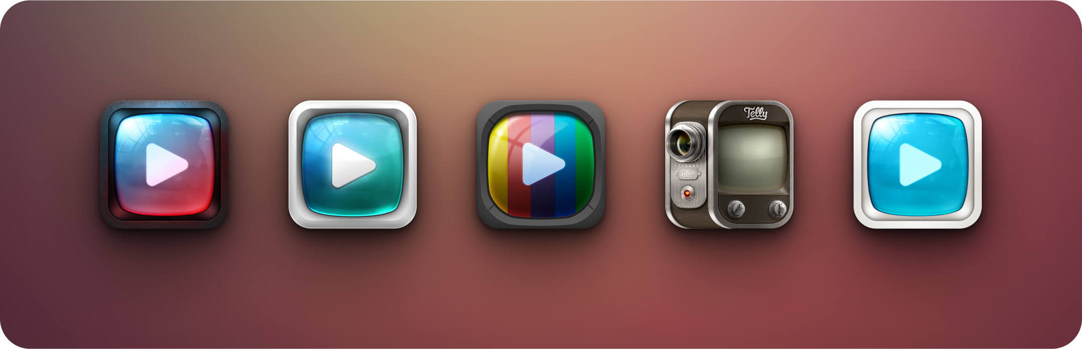
The app icon also went through a lot of iterations. At first we took freelancers to help out, but I quickly realize I was able to make them myself. Also the fast iterations on them didn’t really give me an option.
These icons would stand out way too much on today’s phone dashboards: